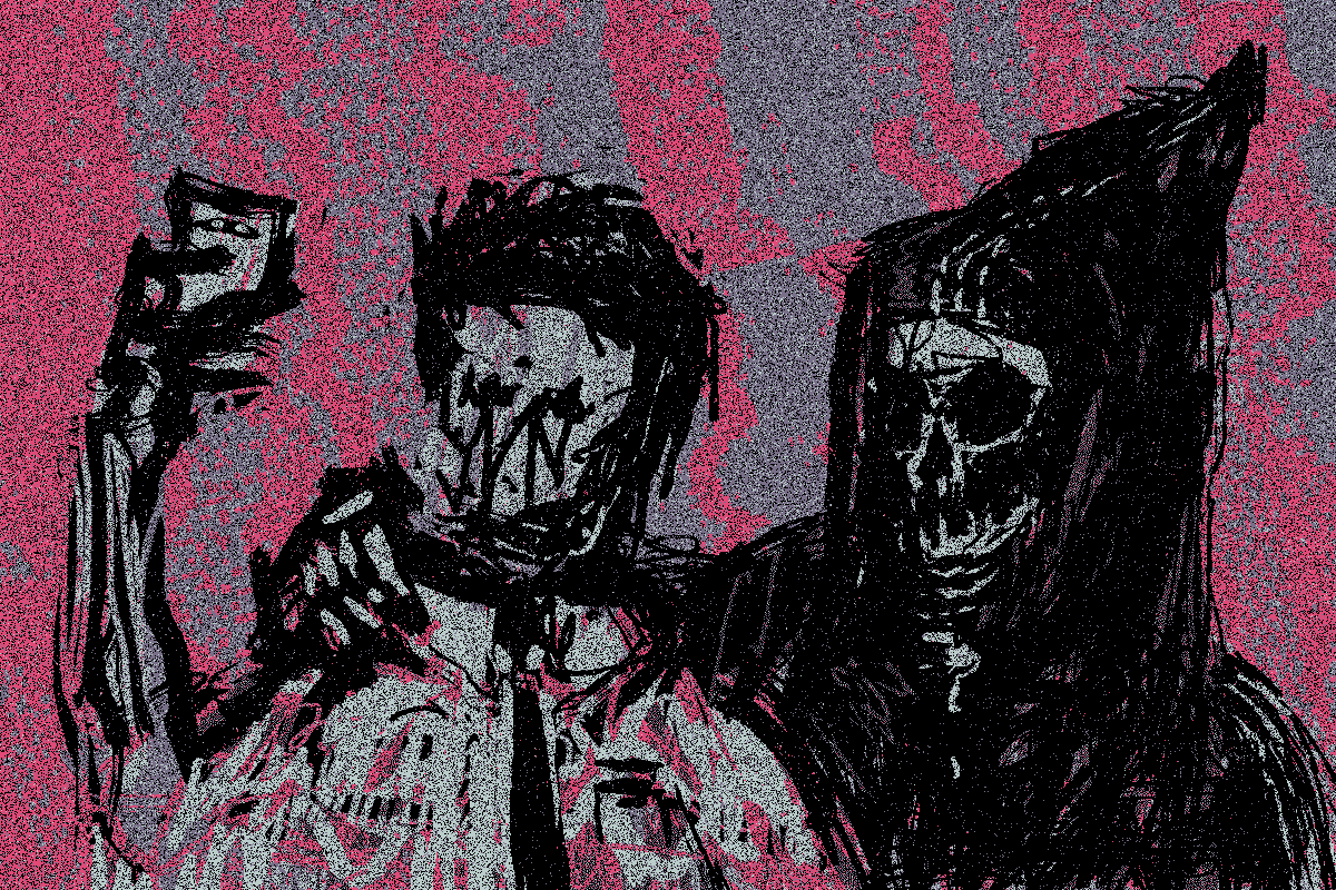
New Cards for KO - A simple but effective UI change

Let's start with a little bit of design history. Back in 2006 Microsoft’s ‘Metro’ design language was initially launched. Focussed on typography and visual simplicity, Metro was one of the earliest examples of card design UI/UX. It’s now 15 years since its release so it’s safe to say that card design UI is not a new concept!

Contemporarily, popular card UX patterns can be seen in use across most platforms including Facebook, Pinterest and Google. The card pattern has been widely adopted as it offers a flexible structure across a multi-device paradigm.

A typical card consists of a combination of media, title, text, and action blocks that present a singular idea whilst a card component simply provides a summary and an entry point to additional information.

In KnownOrigin’s case, the card in this instance represents the artwork and the current state it is in. The different states range from ‘Buy Now’, ‘Starts In’ and ‘Place A Bid' whilst the card design also clearly displays the edition size, creator and the artwork title.

Some additional visual updates are the introduction of a border, shadow, and background colour. You may also notice the content and whitespace being used more effectively throughout the platform.

There are many advantages of using card components, these are the ones we consider the most valuable:

• Design can be kept consistent The card should provide just enough information to help a user determine if they should further engage and /or take action.

• Clear Visual hierarchy The card should have a clear visual hierarchy - this helps the viewer quickly identify which information requires immediate attention and which elements can be considered subsequently.

• One thought, one card The card should provide one clear call-to-action and not overwhelm the viewer. A single card can have many states but good card design should always maintain a single action.

This is a simple but effective update for Knownorigin and we will be continually improving the UX based on user feedback and data insights.

If you wish to help make KnownOrigin even better please feel free to join our Discord, share your insights and take part in our twice-monthly community calls.

Components found their perfect match with Design Systems, and this allowed them to evolve from style guides or reference style sheets to full-blown libraries with modular assets containing Application Programming Interfaces (APIs) for setting a component’s appearance, content, and behaviour.

Since APIs are not visible to the final users, it may not be clear why UX designers should be involved in designing them. Components are first assembled by product teams before reaching the final users, and the API is the main interface between a component and product designers or developers consuming it. From this perspective, developers and designers are the first users of a Design System and their experience should be considered as well.